DEPOP
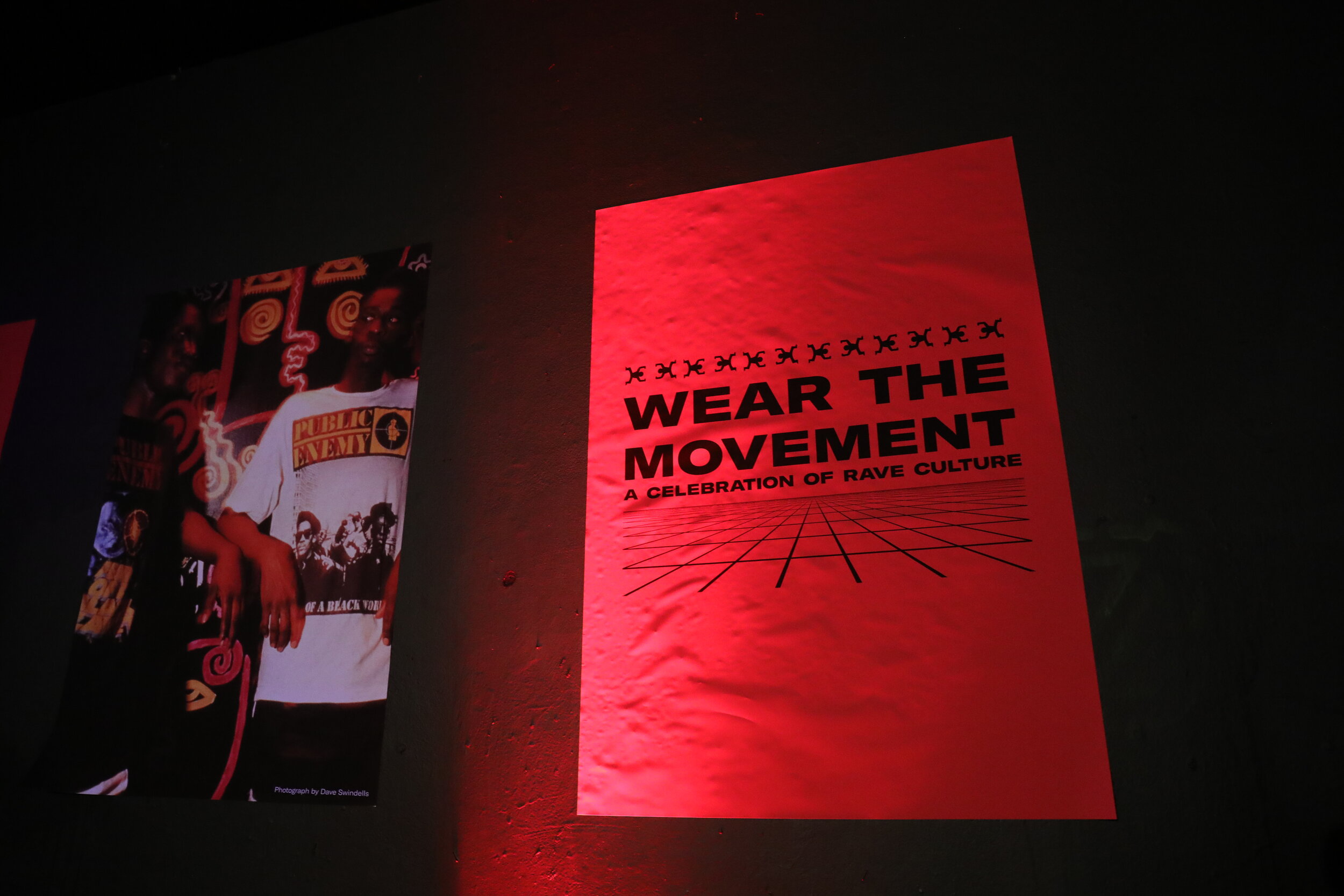
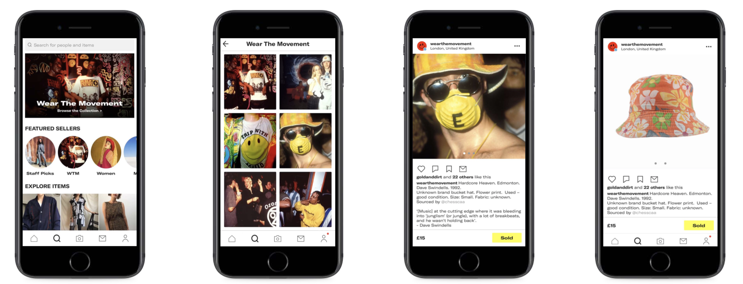
To promote vintage clothing on Depop, we created Wear The Movement (WTM): a 360 campaign that matched archive pieces available on site with archive photography.
WTM was designed to tap into any one of Britain’s fashion defining subcultures from Northern Soul to 90s garage. It launched in Oct 2018 with a celebration of rave culture brought to life in collaboration with NTS Radio and The Youth Club.
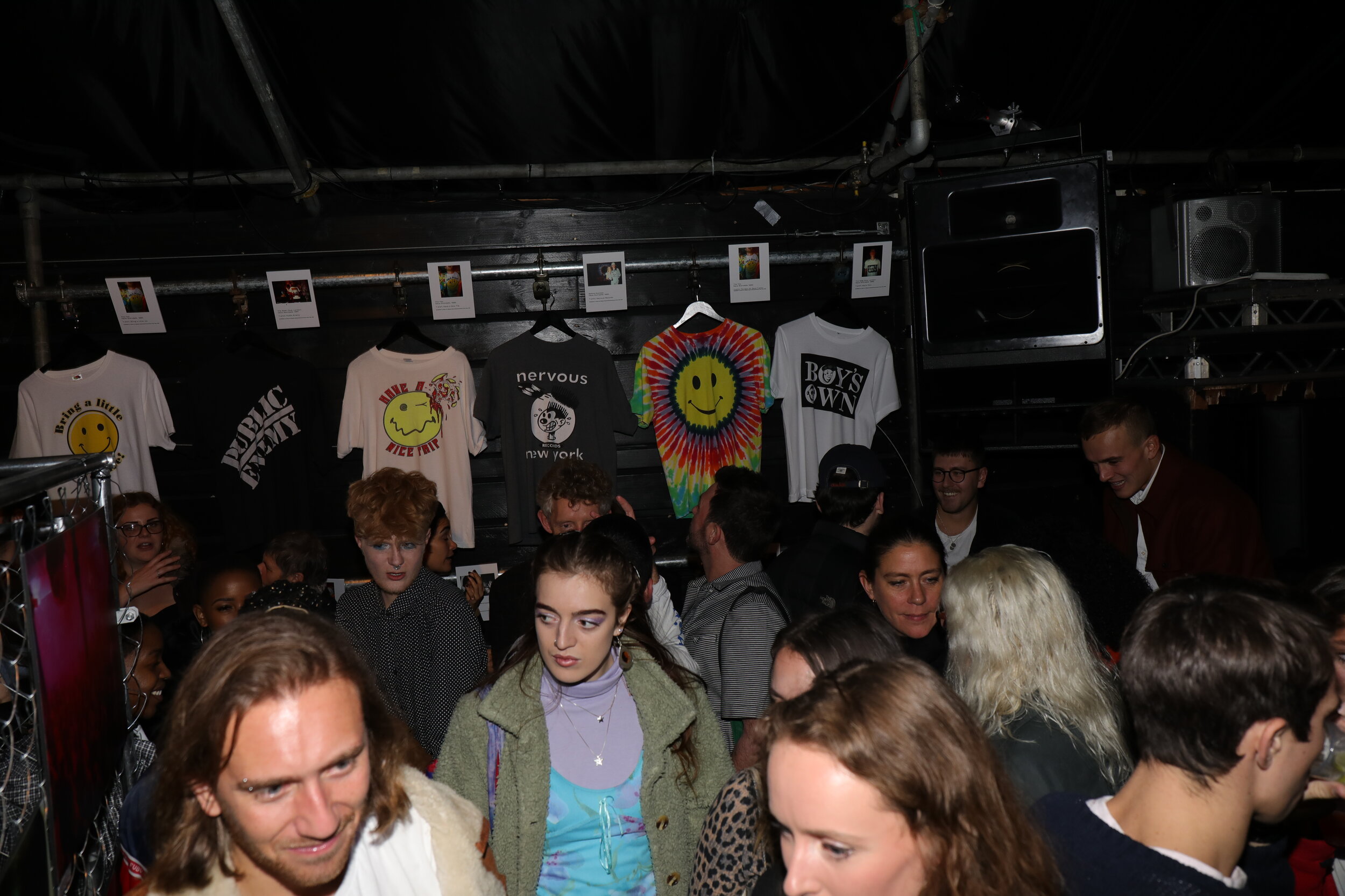
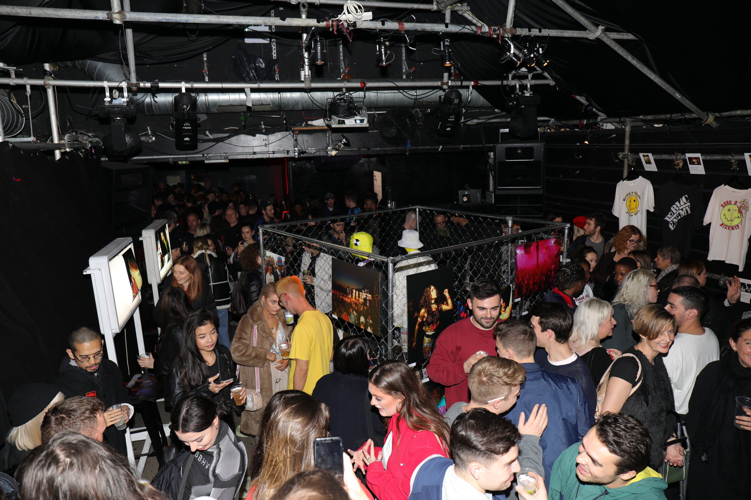
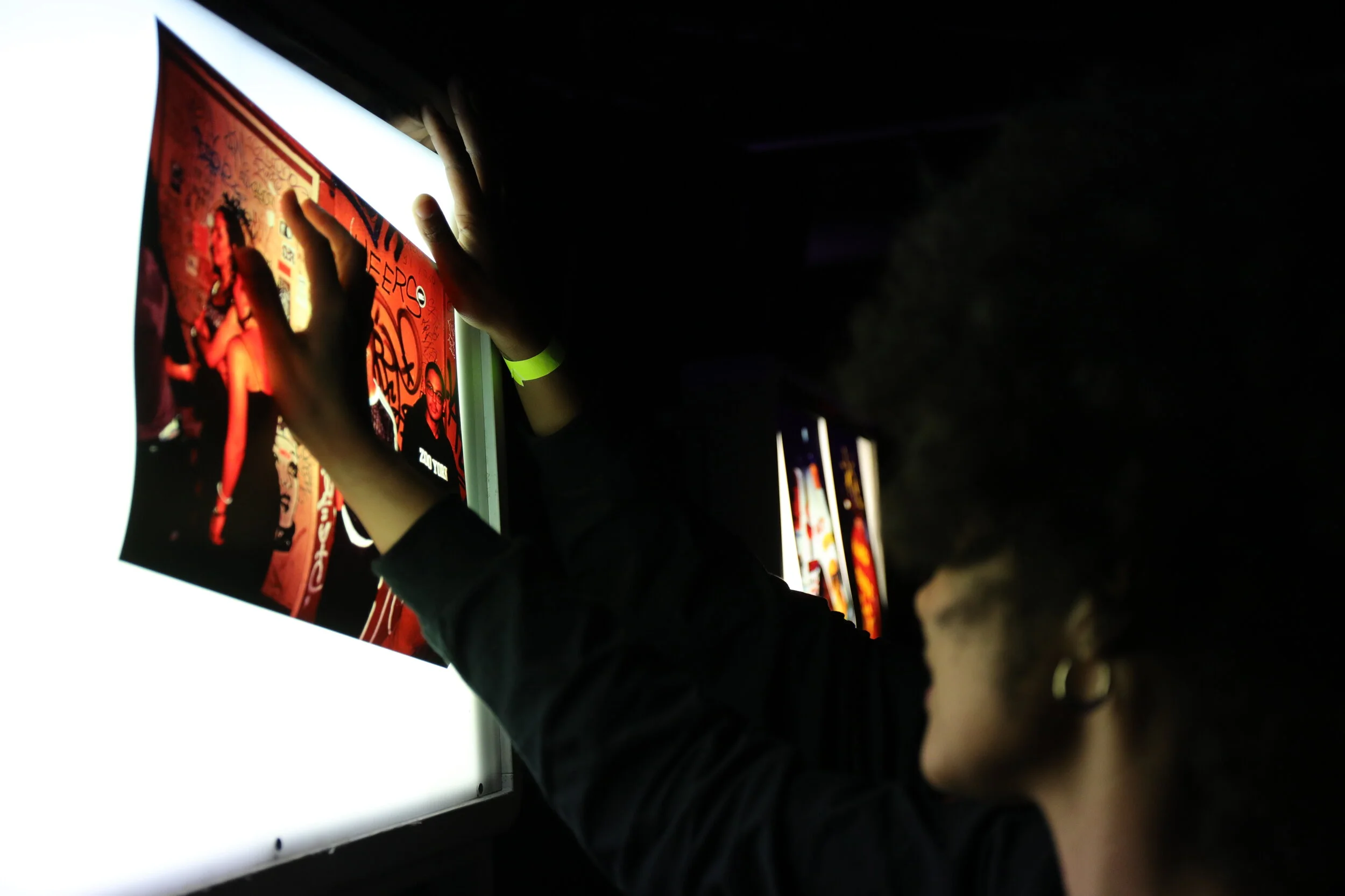
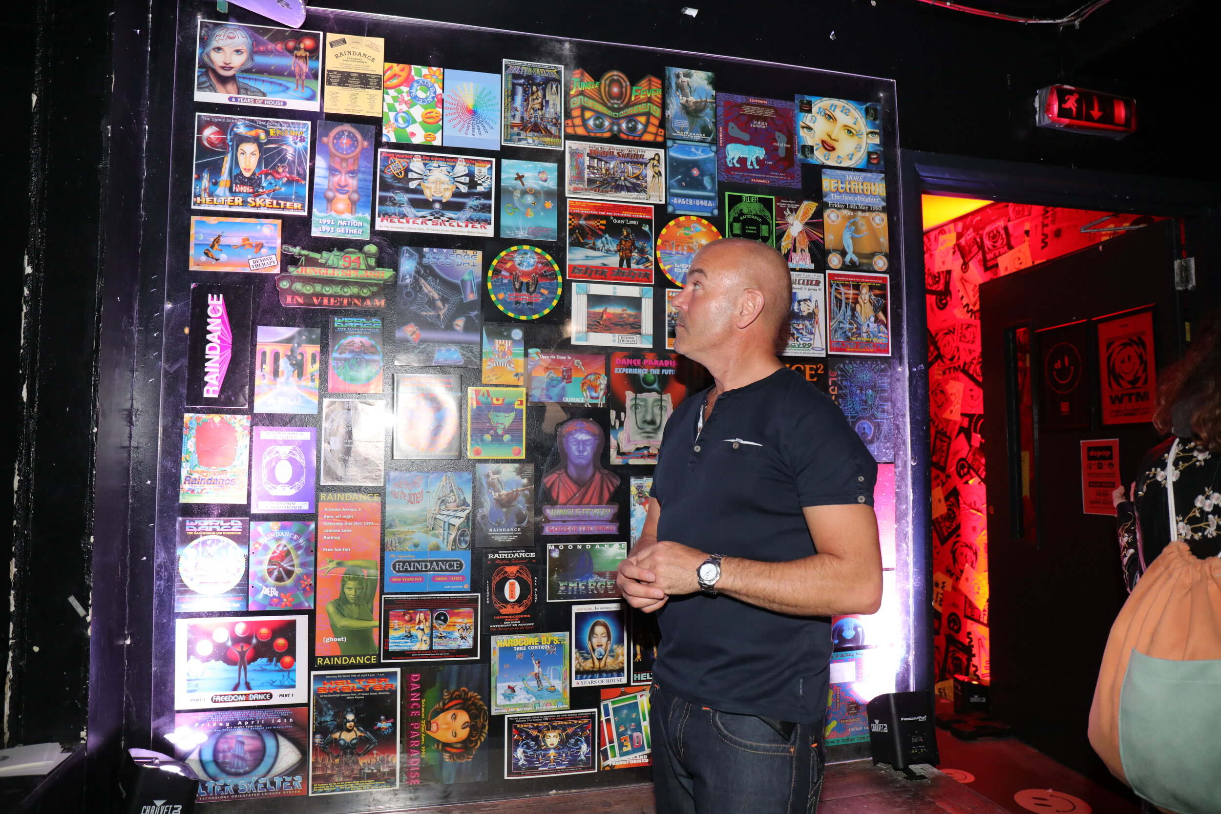
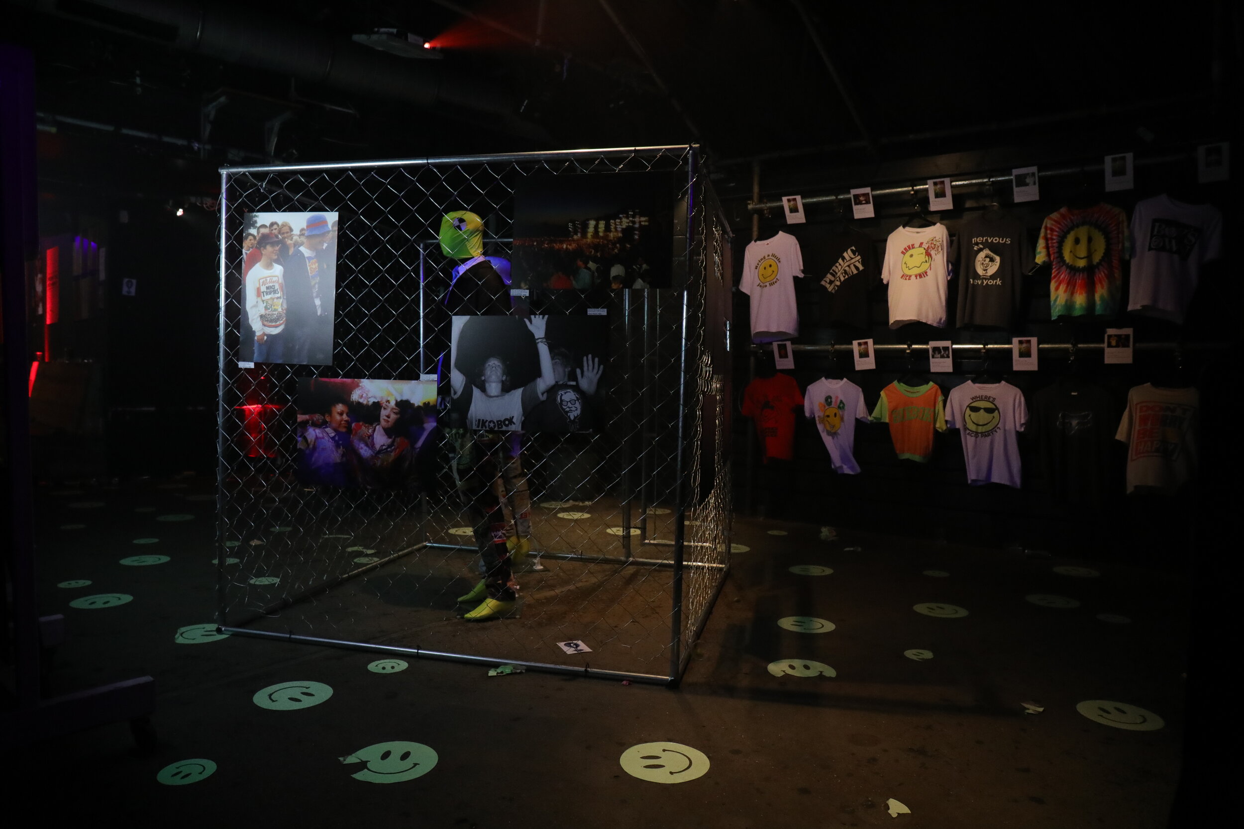
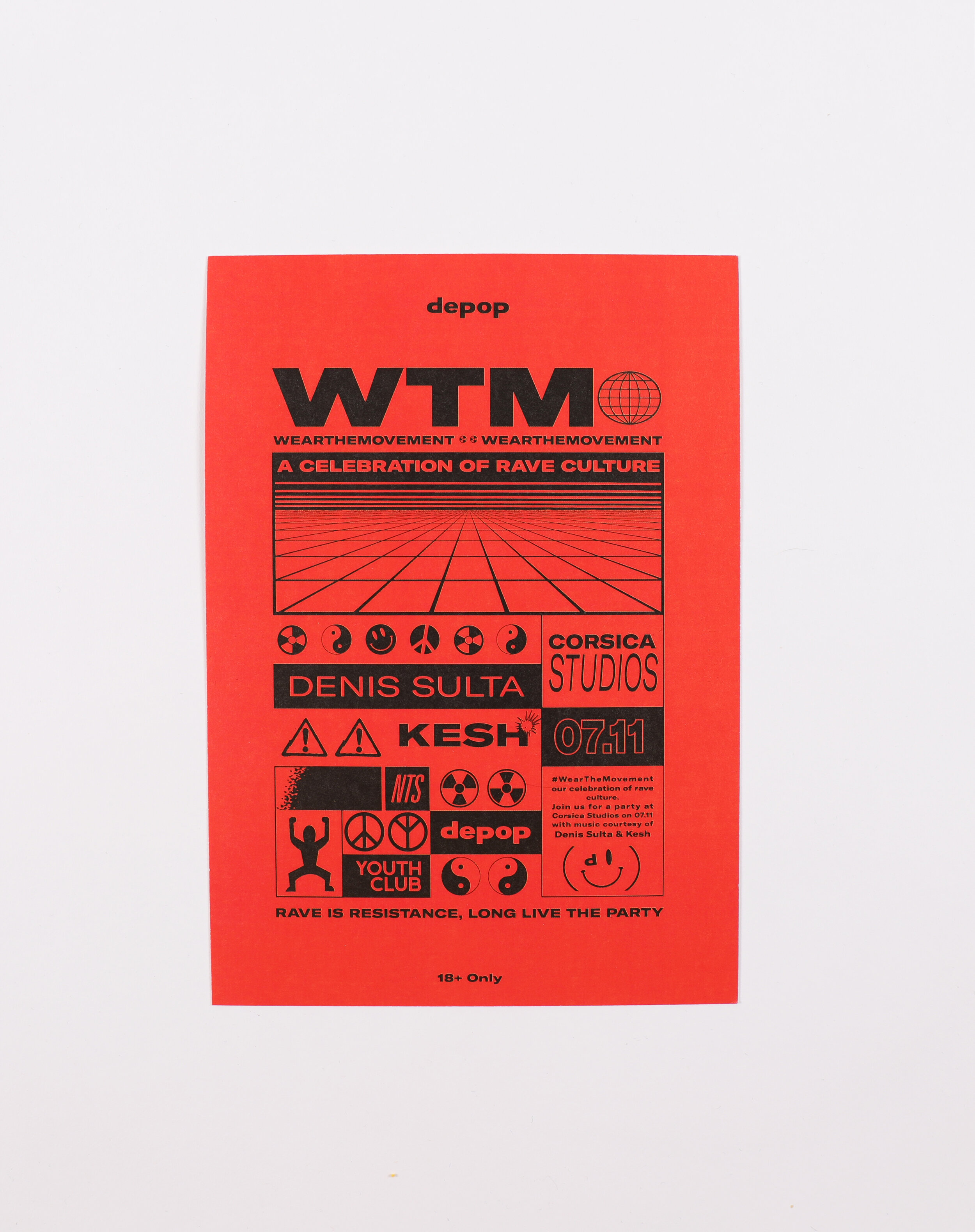
An exhibition and 90s style rave at Corsica Studios showcased original rave clothing alongside archive photos of people wearing the same pieces. All the clothes were sourced by Depop's vintage sellers and were available to purchase on site.
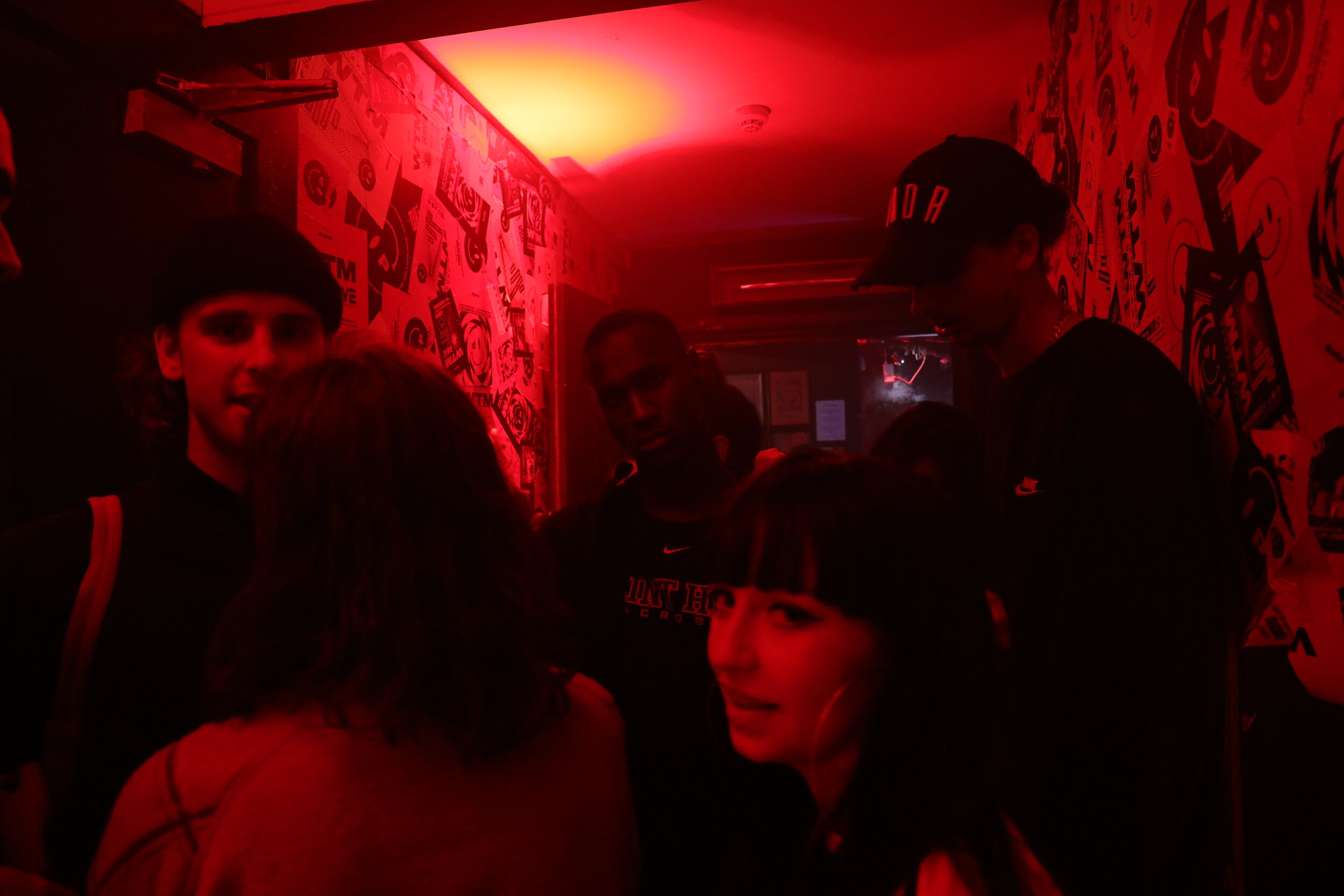
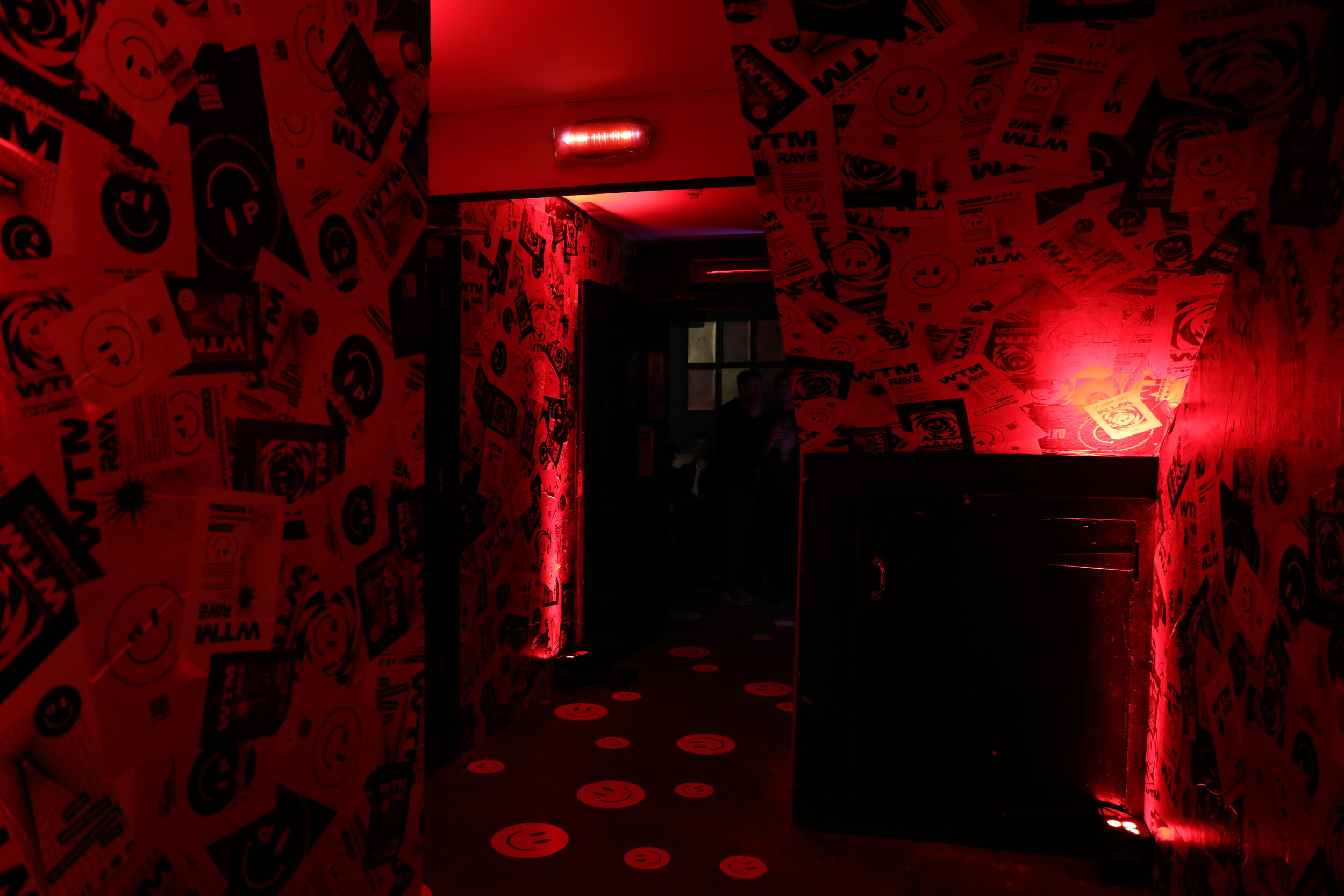
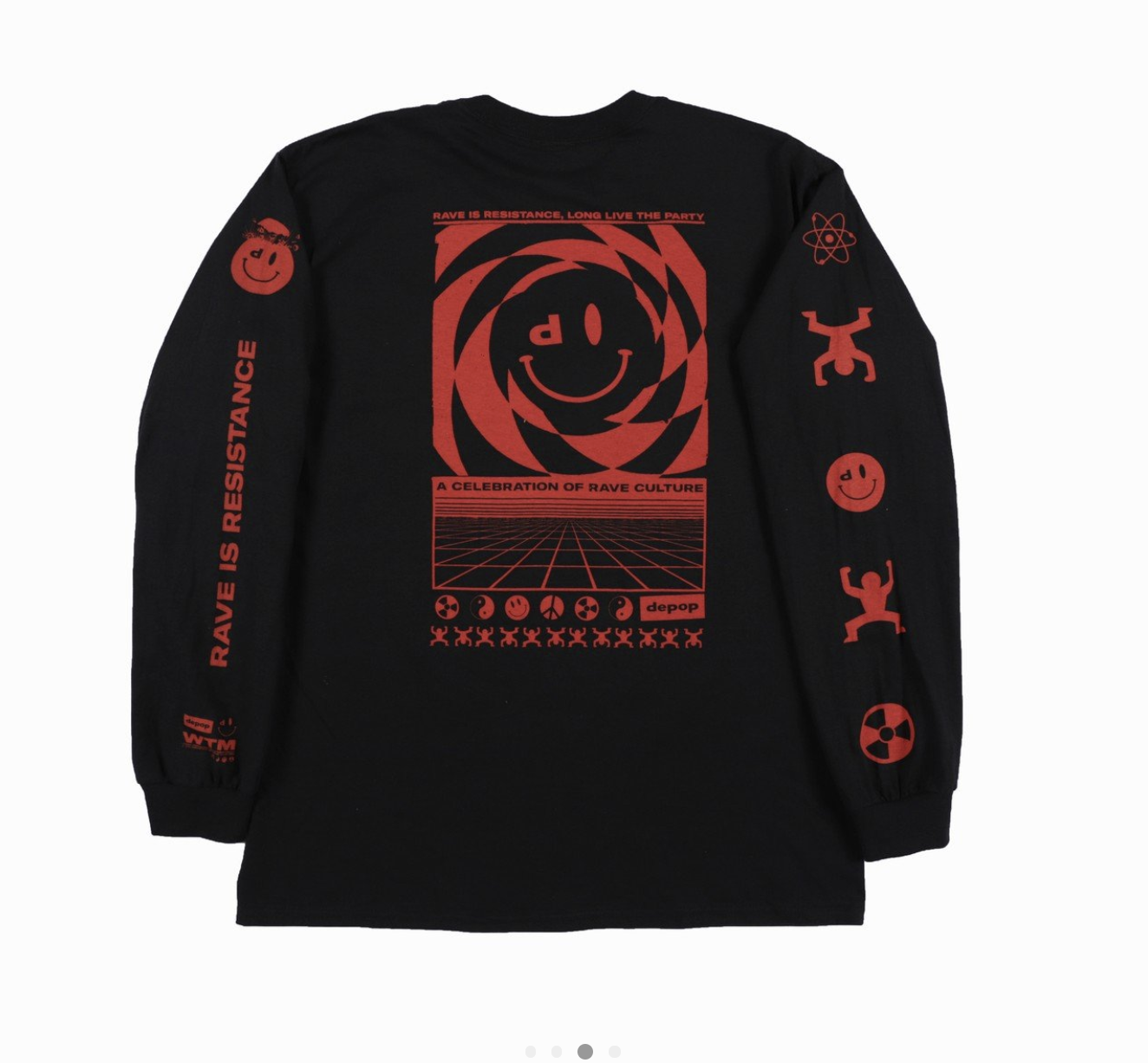
Original rave flyers were displayed with ‘Depop red’ acid house smileys bombed throughout the venue. The artwork for the campaign, designed by Mr Phomer captured the distinctive visual language that was born out of the movement.
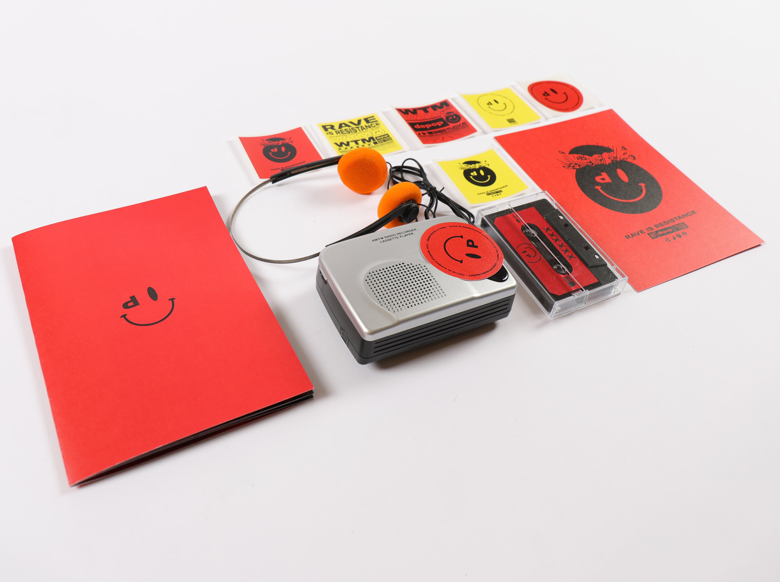
A zine and a short docu film on rave culture and style captured the energy and origins behind the scene.
Mix tapes were sent out to press and a limited run of merch was sold on site
The creative concept flexed across Depop’s e-commerce platform, driving sales as it paid homage to the era


